Time has flown by — and thanks to your continued support, it has now been 20 years since I launched my brand, Bebes by Sayuri.
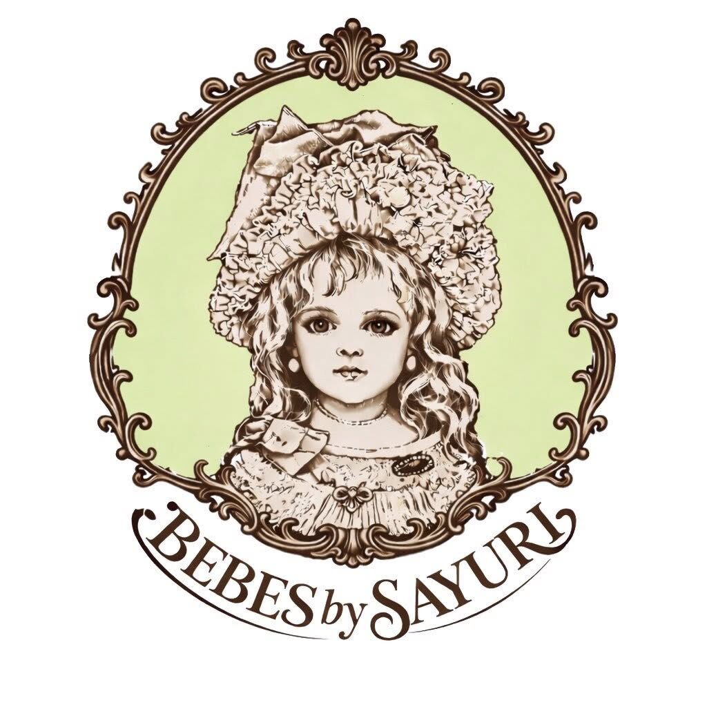
To mark this 20th anniversary milestone, I decided to create an official logo for my brand. Normally, a logo is something you create when first launching a brand, but at the time I simply didn’t have the capacity to think that far ahead. Recently, however, with AI now available as a creative tool that I can use myself, I decided it was the perfect opportunity to finally take on this challenge.
This new logo is based on a doll I created myself and a photo I personally took.
Although I used AI to generate and refine it, the original doll and image are my own work, so I retain the copyright as part of my brand.
I’ll be using this logo for my social media icons, business cards, and eventually for packaging and signage as well.
Keeping print quality in mind, I removed any unnecessary graphics and kept the design clean and simple.
For the background, I chose peridot green—my favorite color and also my birthstone.
It’s easy to see, fresh, and really represents the uniqueness of my brand.
I couldn’t work on doll-making because I had bronchitis for a few weeks, so I started playing around with AI image creation just for a change of pace. Before I knew it, it turned into a serious project.
Most of the time, the AI-generated images didn’t quite match what I had in mind, and I had to revise them again and again.
But once I had a clear vision, everything slowly started coming together.
Sometimes the AI suggested unexpected layouts or design elements, but those surprises often led to great ideas—things I might not have thought of on my own.
In the end, I’m very happy with how it turned out. This logo will now become the face of my brand, and I’m excited to share this next step with you.
早いものでBebes by Sayuriとしてブランドを開業して以来、お陰様で今年で20年が経ちました。20年めの節目として、私のブランドのロゴを作ってみることにしました。普通はブランドを立ち上げたときに作るものですが、当時はそこまで頭が回らず、最近はAIをツールに自分で制作できるようになったので、さっそくチャレンジしてみることにしました。
この新しいロゴは、私自身が制作したドールと、自分で撮影した写真をもとにしています。AIを使って生成・調整を行いましたが、元となるドールと写真はすべて私自身のオリジナル作品ですので、ブランドの一部として著作権は私に帰属しています。
このロゴは、SNSのアイコンや名刺、そして将来的にはパッケージやサインにも使用する予定です。印刷時の仕上がりを考慮し、余分な装飾は取り除き、できるだけクリーンでシンプルなデザインに仕上げました。
背景には、私の誕生石でもあり大好きな色であるペリドットグリーンを選びました。フレッシュで視認性が高く、ブランドの個性をよく表しているカラーです。
数週間、気管支炎のためドール制作ができなかったので、気分転換にAIで画像制作を試してみたのが始まりでした。気づけば、それが本格的なプロジェクトへと発展していました。
AIが生成した画像の多くは、最初は自分のイメージにぴったり合うものではなく、何度も修正を重ねました。でも、はっきりとしたビジョンが固まってからは、少しずつ形になっていきました。
時にはAIが思いがけないレイアウトやデザイン要素を提案してくれることもあり、その“予想外”が素晴らしいアイデアにつながることもありました。自分だけでは思いつかなかった発想に出会えたのは、とても新鮮な体験でした。
最終的には、とても満足のいく仕上がりになりました。このロゴは、これから私のブランドの“顔”となります。この新しい一歩を、皆さまと共有できることをとても嬉しく思っています。